Scripture originates in writing.
Script fonts on the computer are actually 100% nonsense —
— well, actually...
Script very close to the roots
Handwriting
... for example the Biró Script:
An individual handwriting made using a ballpoint pen
The frequently referenced art historian Walter Koschatzky wrote (in his 1981 book “The Art of Drawing”): “Pressing the tip of the ballpoint pen does not produce any change in the stroke weight, there is therefore no differentiation of the line into hairline and dark strokes, [...] (therefore) it virtually rules out any artistic use. Drawings with ballpoint pens have a consistently dead drawing character.”
Calligraphy is, actually, the art of fine writing…
…and actually, written scripts as typeface for the computer are 100% nonsense.
And yet, an obvious thought: Create a typeface which truly derives from everyday handwriting. And since we, if we write at all, utilize practically only a ball point pen anymore, then a modern cursive writing form must look like just that.
As a counterpart to the artistic ”handwritings“ which have long been available as typeface, the thought of digitalizing a truly ”ugly“ handwriting is appealing. After all, time and again there is the need for a text to look ”handwritten,“.
Well, here it is: written freehand with a ball point pen. Finally a truly individual script!
Btw:
the most convincing effect is obtained with a font size of about 18 to 22 points, at which the thickness of the stroke is now about the same as that of a real ball point pen.
Does the Biró Script look dead?
No, on the contrary! Finally a truly individual font!
Unlike the usual computer fonts, Biró Script contains more than 300 real letter combinations (ligatures) in addition to the usual alphabet.
And — OpenType makes it possible: the ligatures appear automatically as if by magic when text is entered.
In this way, the individual characters are very rarely repeated, as they are usually replaced by a ligature.
A text set in Biró Script then looks almost deceptively similar to a text actually handwritten with a ballpoint pen.
buy
Download type specimen PDF
... for example the Conté Script:
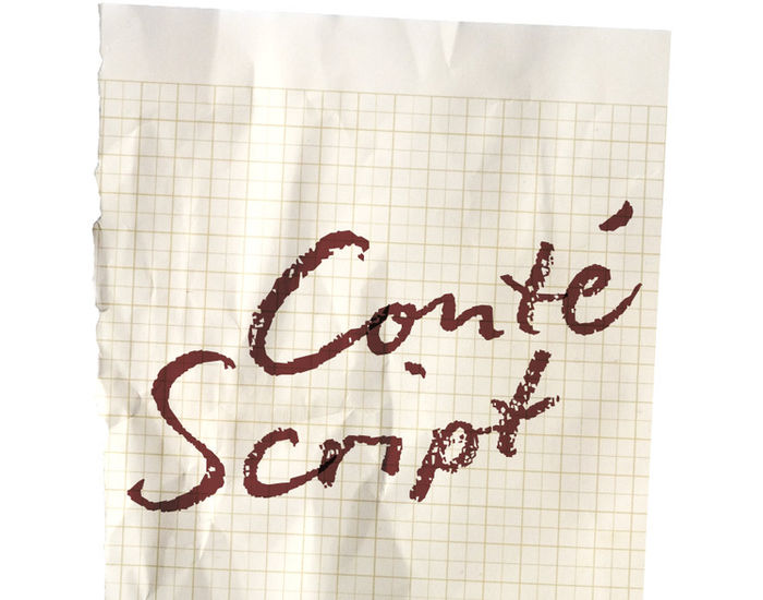
An individual handwriting created with a pencil
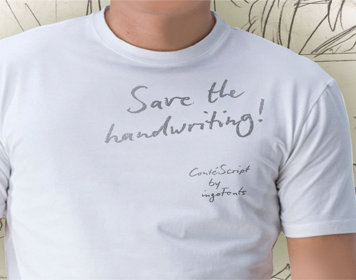
Conté Script looks almost deceptively like handwriting, as if written with a soft pencil on a notepad.
The font appears to be written quickly, fleetingly, casually, as if not really to be taken seriously, and as if it would be written one minute and erased the next.
The typical style of the pencil — crumbliness where pressure lessens and the deep darkness where the pressure of the graphite in its fullest denseness smudges — is another earmark of Conté Script.
In order to retain the spiritedness of the handwriting in the font, various forms of the letters appear in the ligatures of Conté Script so that, for example, an a looks different almost every time depending on with which letter it is (or isn't) joined together.
Conté Script is exceedingly lively, diversified and distinct thanks to more than 300 different ligatures, i.e. letter combinations.
In addition to the letter combinations in Conté Script, there are also double letters and figures included (aa, ff, AA, MM, 22, 66…) as ligatures with stylistic alternates.
Of course, the application of OpenType-Features in your program pre-settings must be activated.
Btw:
Conté Script looks most “authentic“ around the point size of 18 to 20.
Download type specimen PDF
buy
Write like the inventor of the diesel engine — it’s possible with this font patterned after the original handwriting of Rudolf Diesel…
... for example Diesel Rudolf Script:
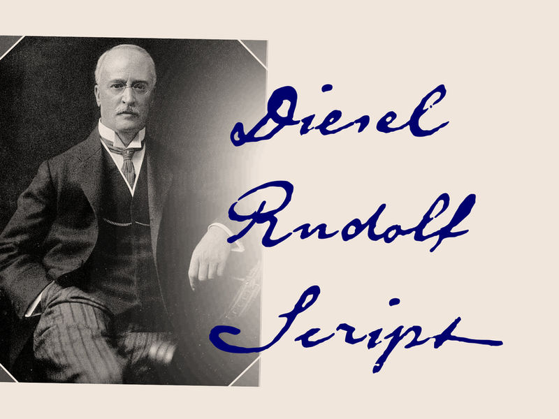
Patterned after the inventor’s original handwriting
In 2008 the city of Augsburg and the MAN Group celebrated the 150th birthday of Rudolf Diesel, inventor of the diesel engine which was named after him.
The engineer and inventor Rudolf Diesel was born in Paris in 1858 and also went to school there. In 1870 his family moved to England and Rudolf was sent to relatives in Augsburg where he continued going to school. Later, after completing his studies in Munich, he began working as an engineer in the machine factory Linde. Alone this part of his life makes clear why Rudolf Diesel’s handwriting was so ”jerky,“ hesitant and inconsistent.
He learned to write according to the French style, that is, Latin cursive — completely different from the very correct and neat German handwriting taught at that time which he had to learn at 13 years of age.
These circumstances explain why his handwriting is ”messy“ (especially for those days) with its mixtures of letter forms within a text, even within individual words.
Plus, he obviously did not attach much importance to ”pretty writing.“ Sometimes the characters are wide, then narrow, sometimes large and clear and then again crammed and primitive.
The individuality is emphasized with characteristics derived from quill and ink.
With the help of a few preserved original letters, it was possible to create a convincing digital version of Rudolf Diesel’s personal handwriting.
The diversified images of the font Diesel Rudolf Script make more than 80 ligatures and stylistic alternates possible which can be selected with help from the OpenType functions Ligatures and Discretional Ligatures.
buy
Download type specimen PDF
... for example Iris' Hand:
The ballpoint pen woman's handwriting
As the name suggests — the Iris’ Hand is a woman’s personal handwriting, written with a ballpoint pen.
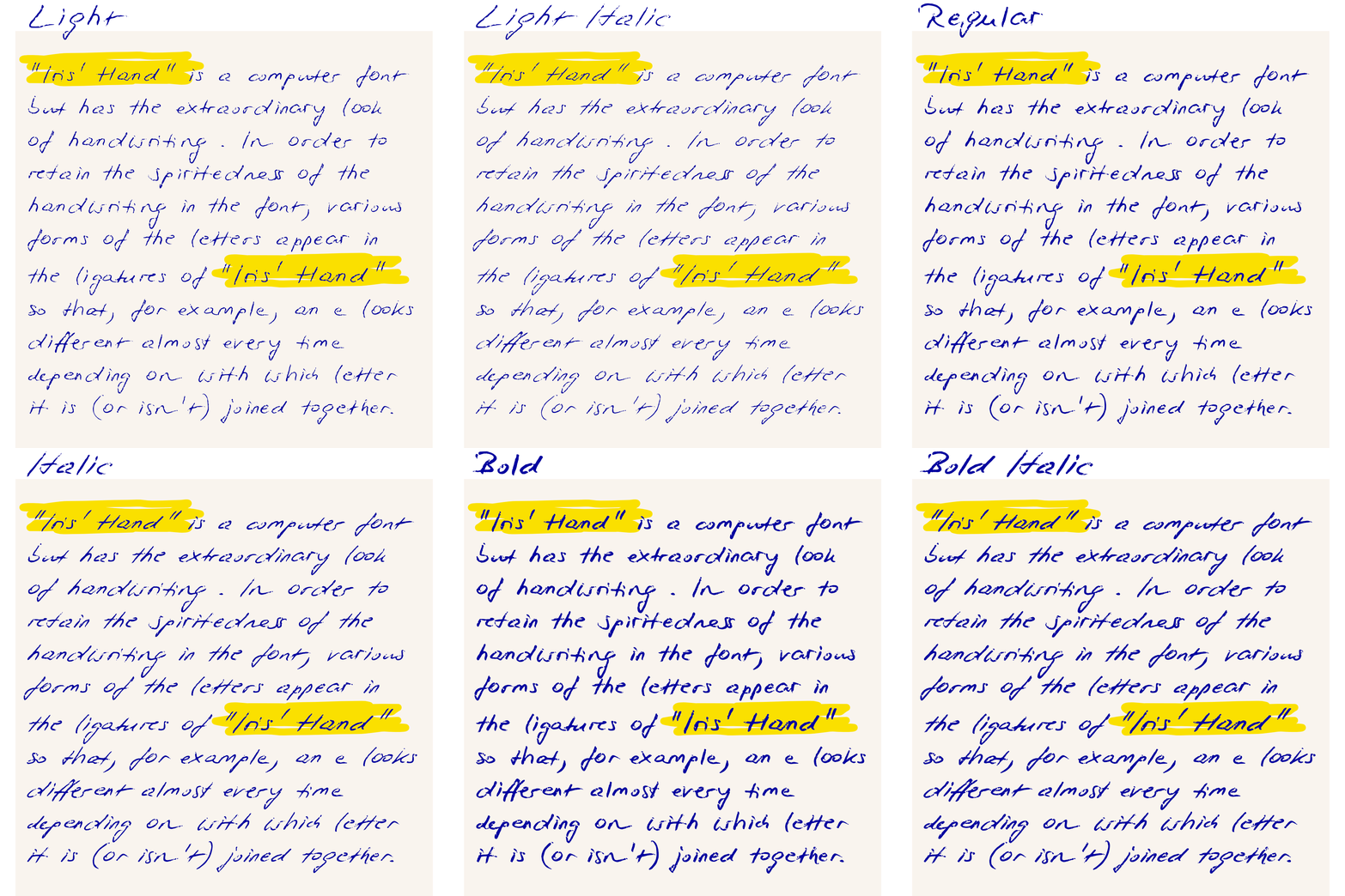
Iris’ Hand is an amazing font — almost indistinguishable from “real” handwriting. Thanks to the over 200 different ligatures — i.e. the combinations of letters — and alternative character forms the typeface is extremely lively and varied.
Really handwritten
In order to preserve the liveliness of the handwritten original in the font, different forms of glyphs appear in the ligatures of the Iris’ Hand, so that, for example, an e looks different almost every time, depending on which letter it is (or isn't) connected to.
In addition to all the letter combinations, the double letters and numbers (aa, ff, AA, MM, 22, 66, ...) are also built as ligatures with alternative forms.
As if by magic
Requirement for the automatic application of the ligatures is that your application supports OpenType-features. Other OpenType features such as “initial or terminal forms,” “discretionary ligatures,” or “fractions,” and others may need to be activated separately. Then the alternate character forms automatically appear as if by magic when entering text and make the text look convincingly handwritten.
Typically, most programs have at least the ligatures feature enabled by default.
From light to bold
The ballpoint pen actually offers almost no possibility of consciously influencing the writing ductus. And yet the ballpoint pen also has its own characteristics, which are clearly expressed in this font. The stroke is not always uniformly thick. Sometimes only a delicate, thin line is created. Often it breaks off suddenly and leaves a gap.
The Iris’ Hand goes even further: In addition to the “normal” version, it is also available in a thinner (Light) and a stronger version (Bold).
More or less oblique
Handwriting is sometimes written more or less slanted. So does Iris’ Hand.
The normal version is only slightly slanted.
But there is also an italic version that is significantly more inclined by 20°, which makes the script appear more regular and somehow feminine.
The Iris’ Hand is also a variable font!
This means that there are not only the usual individual styles — a font file for each style — but when using the variable font, all variations are available in a single font file. And every intermediate level can be created and displayed with it — as long as the software supports this still young font format.
buy
Download type specimen PDF
