


What if it’s overdone…?
geometric or constructed
or just both
yesyes … it’s true … a good font should be as simple as possible.


… for example Constroke
The idea behind it:
to construct letters according
to geometric principles
— without correcting the
inevitable optical imbalances
and unsightly thickening.
So place the horizontal line in E and H really in the middle, instead of raising it a bit like in “good” typographical manner. And with the E, all three dashes stay the same length.


The main feature of the Constroke is the constant stroke width.
Especially in the heavier weights, veritable blots are created when two lines meet, for example at n, m, w, etc.
The thickest weight results from the small e with its horizontal line in the middle, the one without optical compensation would merge into a round black dot from a certain stroke width.
It is not because of our supposedly “modern” present that good rules are no longer relevant. However, they are only effective under certain conditions. If you look at the font at an angle and from the side, it suddenly doesn't matter whether and how balanced the characters are. The distortion we then perceive makes all artistic and technical efforts pointless. An O viewed at an angle is just a distorted oval, whether drawn optically correctly a little taller than it is wide, or whether the stem is a little thicker than the hairline. With the straight shapes, the effect is even more pronounced: viewed from an angle, the difference in line widths appears absurdly reversed, making what was just thick appear thin and thick what should be thin.
[
]


Another typical feature of almost all
geometric fonts is the round small a.
A true circle appears wider than it is tall,
which is usually compensated for in character design. Not so in Constroke.
The circular and therefore a bit too wide
letters a b c d e g o p q are the characteristic distinguishing feature compared to other
sans serif fonts.
The round shapes are really circular.
And then I also ignored the basic typographical rule that says that the vertical stems must be thicker than the horizontal hairlines to appear equally bold to our eyes.
The visible thickening that occurs when two lines cross or converge is simply accepted with the Constroke.
But it wasn't just such theoretical considerations that made me break the good old rules. The sheer joy of breaking the rules and ignoring perceived necessities such as ink traps allows for an informal approach to assembling the characters from a few basic geometric building blocks.


Eventually I found enough varying solutions for all letters of the alphabet and figures. A font designed in this way doesn’t really have to be extremely legible, which is why I forwent creating lower case letters.
Nevertheless, Fundstueck still contains some diverse forms in the layout of upper and lower case letters. Thus, the typeface is a bit richer in variety.
Fundstueck includes only the alphabet and the usual Western European accents (without the Scandinavian).
Only the most necessary punctuation is included.
By the way — the “lower” letters with accents and umlauts stay between the baseline and cap height. And with that, you get wonderful ribbon-type lines.

… for example Fundstueck
Inspired by a rusty piece
of metal, a coarse but
decorative font was created


“Fonts can be so simple.“
That is what I was
thinking as my attention
was turned to this rusty
piece of metal. Only a
few centimeters in size,
I couldn’t imagine which purpose
it might truly serve.
But my eyes also saw an E, even a well-proportioned E: a width to height ratio of approximately 2/3, black and fine strokes with a 1/2 proportion — could I create
more characters on this basis?
Thought it, did it.
The form is based
on a 5mm unit.
The strikingly thick
middle stroke of E
suggests that the
emphasis is not
necessarily placed on
the typical stroke, and
likewise with the other
characters. But if the
font is going to be somewhat legible,
then you cannot leave out slanted
strokes completely.

… for example
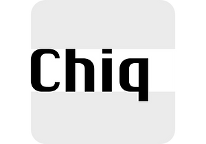
Chiq
The name suggests it:
the Chiq is inspired by a
well-known system font
from Apple’s classic Mac OS
operating system.


By revamping and expanding good old “Chicago”, I want to make that 90s tech charm available for the future.
Simple, simple, simple
The idea of creating a typeface whose vectors were constructed as simply as possible also played a role.
The appearance of digital type is described using mathematical vectors that are defined by a series of corner and curve points — the anchor points. And some technical applications still require a font that is as simply defined as possible and has as few anchor points as possible.
The shapes of the Chiq are constructed according to a very simple principle. The contrast of stems and hairlines becomes more pronounced towards the bolder weights.
A few basic shapes form the framework for all characters
The shapes are very regular and sometimes formsomewhat unusual figures, which has a negative effecton readability and makes the font rather unsuitable forlong passages of text, but results in a very even typeface.
This is particularly true for the extra-wide Ultra Expanded, which is so wide that you can no longer recognize word images but literally have to spell them out. In this way, words are turned into letter bands with a great decorative effect.
A complete family
With variants from “Light” to “Black”, from “Normal” to “Ultra Expanded” and the italics, Chiq reaches beyond its archetype. This opens up a wide range of uses. It is even clearer, even more sober, and to a certain extent speaks an even more modern formal language.
Chiq is also a variable font!
This means that there are not only the usual individual styles — one font file for each variant, but when using the variable font you have all the variations available in a single font file. And any intermediate level can also be created and displayed with it — assuming the software supports this still young font format.


Shadow font & layer font
The Shad is the almost illegible cousin of the Chiq. As the name suggests — it consists of the shadows of the letters.
And the bolder the font style, the deeper it is. The “Light” only has a thin shadow, while the “Black” casts a very deep, broad shadow.
Unlike Chiq, the Shad is only available as “static” fonts (individual font files for each variant). Due to the different geometry of the shadows of different depths, a variable font is unfortunately not technically feasible.
Shad only consists of the letter shadows, the corresponding letter remains transparent, i.e. without filling. The metrics (spacing and character widths) correspond to those of Chiq, so that both fonts can be placed congruently on top of each other.
When you combine and play with the two fonts, very attractive effects quickly emerge. Shad brings a bit of 3D into typography.


… for example Guhly
A modern Sans Serif —
prosaic, designed geometrically, beautiful in large sizes.
The design of a shampoo bottle stands behind the creation of this sans serif display font.
All the dimensions of the font are based on Factor 10.
The general principle of construction leads to slim forms and nearly equally wide characters.
So the font appears very solid but is actually difficult to decipher in longer texts.
Along with the ”normal“ GUHLY Regular there are also the two versions GUHLY Light and GUHLY Bold, whereas in each only the vertical strokes [GUHLY Light] or horizontal [GUHLY Bold] have been changed in strength. The result is a very individual decorative effect which slightly reflects old circus and western scripts.
The lower case characters in the version GUHLY Book are optimized to be suitable for longer texts in smaller font sizes — because after all, sometimes you should read a bit more than just the headline…


Prominent, clearly constructed forms with circular arcs define its appearance. This is a font primarily designed for use with capital letters — for all sorts of advertising purposes, headlines and titles.
But lower case letters also belong to a good functional font; so, of course, GUHLY includes them and ligatures for the more ”critical“ letter combinations as well as stylistic alternates for the letters K (or k), V (v) and o.
As a decorative “bonus”, the GUHLY family also includes 2 variants of the “normal” weight:
GUHLY Cutout — these are letters without internal spaces, as if the letters had been cut out and the internal areas had fallen out; and the GUHLY Stencil — as the name suggests, a stencil font with the typical bars that give a stencil the necessary cohesion.


